Daaaaaaaaamn, Nintendo, Back At It Again With the Sexist Design
I love Fire Emblem. I really do. For all the plans I have for articles that will seem to contradict that, Fire Emblem is the franchise I always come back to when I’ve been away from gaming for a while. The first “real” game I ever played start to end was Fire Emblem: Shadow Dragon, and, let’s be real, we can probably trace my love for medieval fiction back to my love of the series.
That being said…
The design differences in costumes for the male and female forms of Byleth are pretty atrocious.
Who is Byleth?
For those out of the Fire Emblem loop, a recent Nintendo Direct included new promos for the upcoming Switch title Fire Emblem: Three Houses. It, like previous titles Awakening and Fates, will allow the player to customize their avatar, or at the very least decide whether they’d like to play as a man or a woman (phrased in the promo as “Choose your form,” which I actually really like, but that’s beside the point). This protagonist’s name (which I can only hope is also going to be customizable, as Robin and Corrin’s were) is Byleth. For the purposes of our comparison, let’s refer to the male and female versions of Byleth as “m!Byleth” and “f!Byleth.”
Caught up? With that settled, let’s start by examining the costume of m!Byleth.
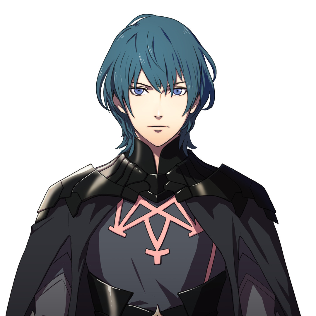
M!Byleth
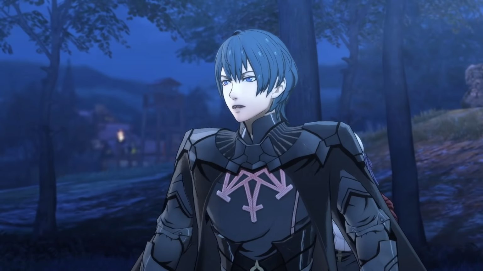
I like this design a lot. It’s fairly simple, but it’s also quite elegant. The high collar of the pauldron-like shoulder piece brings a lot of the elegance the design has into the mix, and the pointy bits give it the look of drape you’d expect from fabric, allowing it to look like a natural part of an outfit despite probably being a metal decorative armor piece. The cape’s sleeve slits look a little weird in the 3D models (see below), but that’s the price we pay sometimes; they look fine in the 2D portrait, which is really what I’m dealing with here. The shirt’s fine—pink being the accent color is a really nice choice in my opinion, and I always love a nice geometric design.
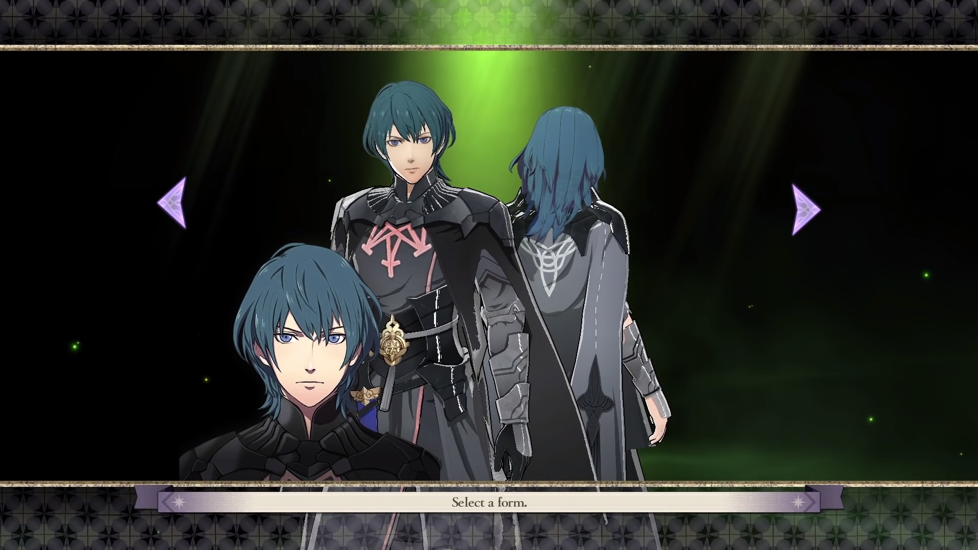
My one critique here is that the belt is a sort of weird choice. It sort of reminds me of corset belts, and if you’re going to armor your stomach you might as well also armor your chest (to gently misquote a friend, the heart lives under there). But Theo, why is the belt weird and the shoulder thing okay? One word: aesthetic.
But let’s be real. You knew as well as I do when you clicked on this article that it’s not about him; not really. He’s only here to stand in contrast to his female counterpart, the person this is really about.
…And here she is.
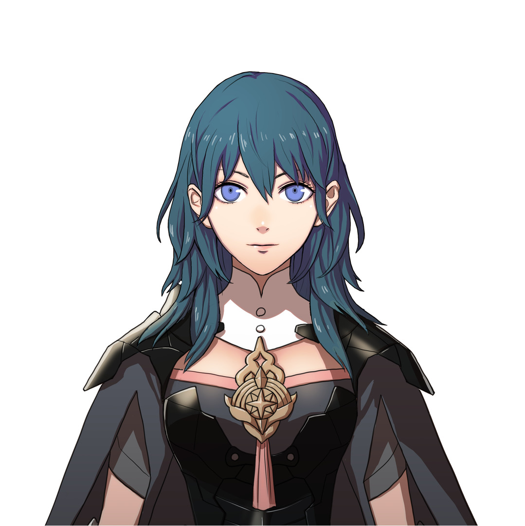
F!Byleth
So there’s… a bit to unpack here. We’ll start with the obvious: the titty window. It’s completely unnecessary—as they always are—and beyond that, it doesn’t really even make sense from a strictly “how clothes go on human bodies” perspective. The neckline is straight across, and there don’t appear to be sleeves or straps of any sort anywhere near that neckline (which is even more odd because there are sleeves). A chest curves downwards, which raises the question of how is that staying on her body? Are there secret back straps that hook to the collar? The world may never know. If we assume this is our only criticism, though, it’s a fairly easy design tweak—a sweetheart neckline, as seen below in a tweaked version of the image, is much less prone to the possibility for an unfortunate malfunction (and it’s just a more elegant choice than the straight neckline, especially with the charm breaking things up).
“How does that even stay on” is far from my only issue here, though. The bustier armor would get in the way of breathing—metal doesn’t expand as a chest does—and you know what always makes battle easier? Pain every time you breathe. Take it from the guy who’s gone swimming in a chest binder—doing strenuous activity in something that constricts your chest is a phenomenally bad idea, and even a short while can have lasting consequences. It also exacerbates the issues presented by the weird space between her neckline and the high collar: There is a giant area right where f!Byleth’s heart would be that has absolutely no protection. If she gets stabbed, she’s in trouble. And given that she’s got a weird dangly charm in the middle of the cleavage window that would be a prime handle by which to yank her onto a knife? She’s just generally in trouble where getting hit in the heart is concerned.
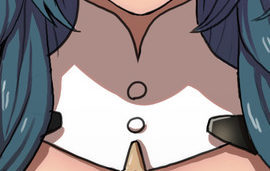
This collar is also an odd choice. This one’s not related to the objectification of women that runs through these games with horrifying regularity, nor the overall impracticality of her design versus m!Byleth’s so much, but it’s still just incredibly odd. Where does it close? There’s no separation in the front down the button line, so the buttons are clearly ornamental. Is there a secret zipper in the back? Why? Who made these design choices? Someone went out of their way to give m!Byleth a crease in the front of his shirt, so clearly overall lack of detailing wasn’t the issue. I know this is a silly thing to be hung up on, but this whole design just… vexes me. I also think she should have full sleeves that look properly attached, but that’s a minor issue (as is this stupid collar, honestly, but I stand by my choice to write this much about it) compared to everything else.
And that’s all that could possibly be wrong here, right?
Nope.
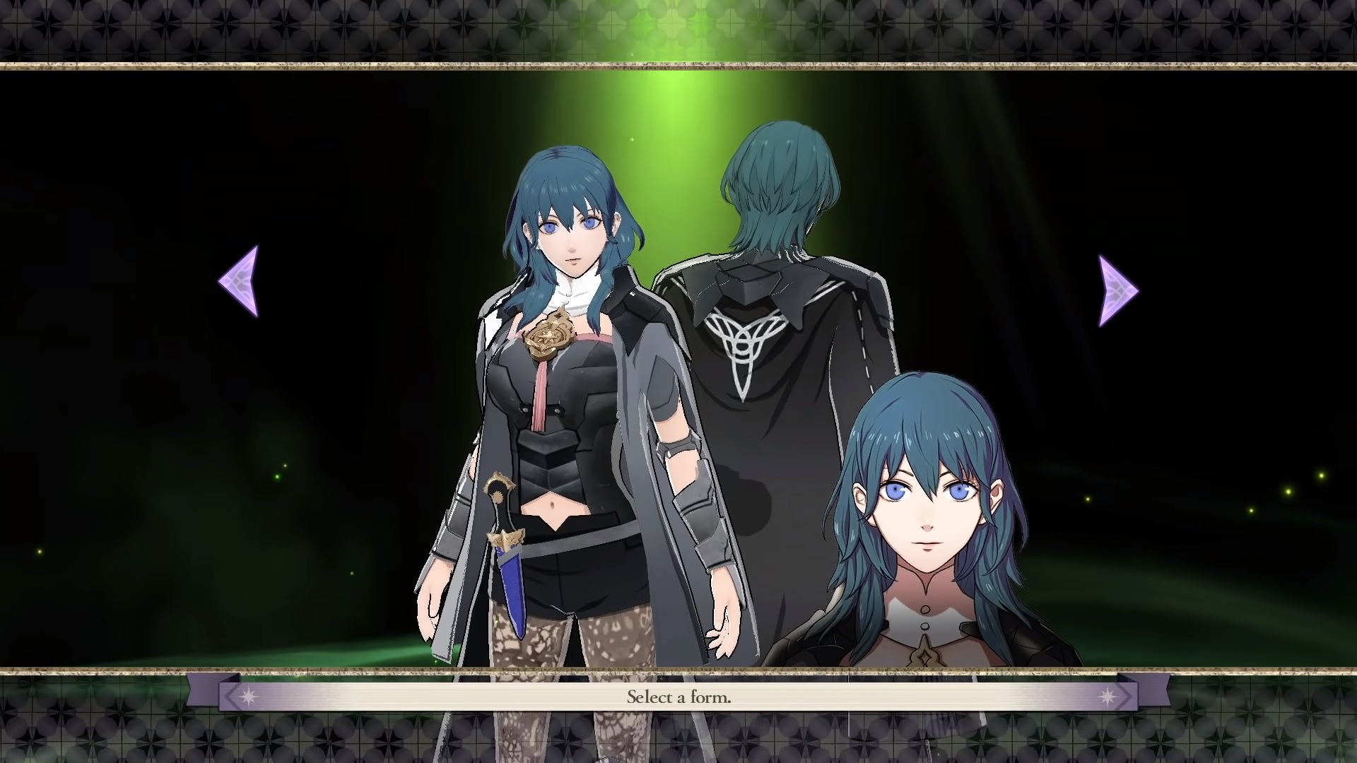
He gets pants. She has shorts and lacy tights and a tummy window. There is literally no good reason for their designs to be this vastly different. While this is by no means the most egregious example of Fire Emblem women having super revealing designs (cough Camilla cough Tharja cough) standing next to men with perfectly normal, if a bit dramatic, designs, it’s the one that’s most relevant right now and the one I’m currently most fired up about. And I’m not, on the whole, opposed to fan-service-y designs, nor am I saying hers is necessarily fan service. But if you’re going to contend that two designs are of the same character, with their only difference being their genders? It’s suspicious when the male version is covered from ankle to neck and the female version is in lace tights and bustier armor.
What Do You Think?
What are your thoughts on Byleth’s designs? What tweaks, if any, would you make to either? If you draw a redesign of the female version, feel free to drop a link; I’d love to see some!
Disclaimer: Disagreements that hinge on an in-world explanation will not be engaged with. She is fictional. She did not decide that that was how she wanted to dress. Please read basically any article about female superhero costumes written by a woman.




4 Comments
Would love pants and no tummy window
Both of their hairstyles, hair color, and eye colors are absolutely hideous and am quite disappointed they cannot be customized, although simultaneously understand why that is.
Her eyes are twice the size of his. Her belly says: easy stab. The color palette is mismatched. And her haircut is quite hideous. KAWAII Japan, very Kawaii
Right! Her eyes are what bother me most. To an extent, as a woman, I would honestly prefer clothing that I can breathe in an move quickly in. But on the other hand, she’s just pointlessly sexualized at this point. But her eyes? Why are they so massive? Her face is just unsettling to look at. I genuinely think that male Byleth is better-looking, and I’m a goddamn lesbian. That’s how bad her design is.